I started this assignment by carrying out some research around the typical styling of Penguin Books, how to pitch and structure an information book for children as well as collecting some examples of cover and content design for children’s information books in general and books on design for children and adults.
Penguin Books House Style
Do Penguin Books follow a particular style? What are their values? Should my designs be in keeping with an already established house design style?
Penguin have quite a few series’ of books, a number of which are listed on-line here:
https://www.penguin.co.uk/search/?ctype=w&p=3&o=newest_first&f=i%3APenguin%2BClassics
Some examples are below:
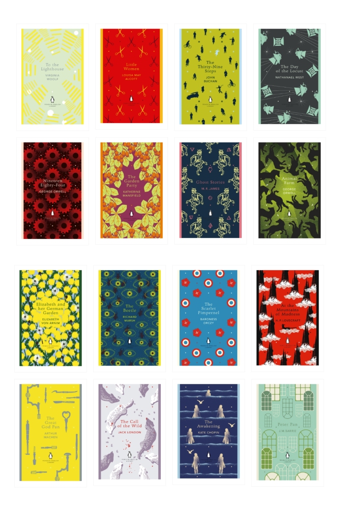
Penguin English Library Series
This series includes fiction from the 18th century to the Second World War. Designed with patterned covers illustrated or commissioned by Coralie Bickford-Smith.
Interesting article on the Penguin website about these designs:
https://www.penguin.co.uk/articles/features/2018/jun/coralie-bickford-smith-penguin-english-library/
Penguin Books for Boys
A series of books whose cover designs were commissioned in 2008 by Coralie Bickford-Smith for Penguin. Illustrators were Neil Gower, Mark Thomas, Mick Brownfield, Despotica.
On her website, Coralie Bickford-Smith says the following about these designs: “The covers, with their action-packed illustrations, hark back to the golden age of adventure books. The controlled use of colour gives the series a strong identity, while each cover individually contains elements – particularly the typography – appropriate to the time it was first published. There is an unashamed nostalgia about them, though they aren’t facsimilies of old books – they are designed to have a freshness and appeal for younger readers encountering these stories for the first time, as well as for their parents’ and grandparents’ generations.”

Penguin Modern Series

Pocket Penguins
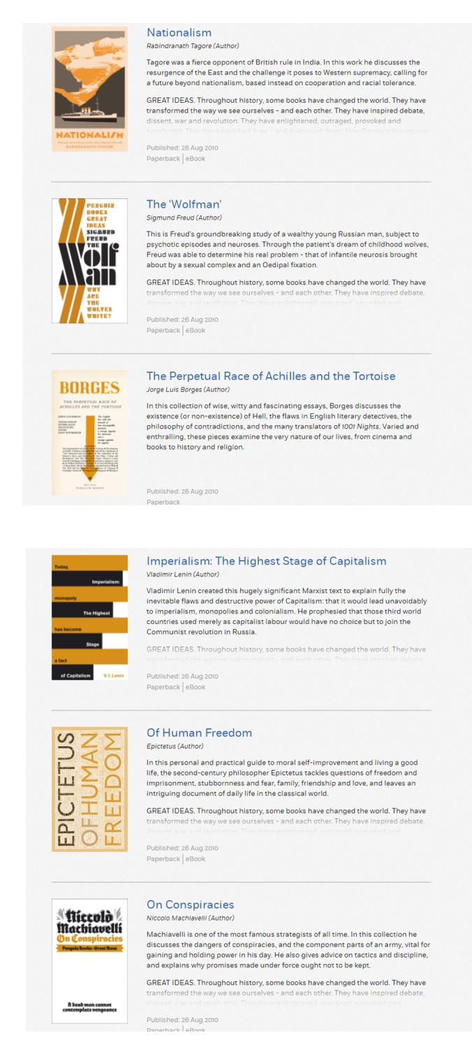
Penguin Great Ideas Series
Penguin Classic Horror

Penguin Christmas Classics

Penguin Monarchs

Penguin WWII Collection

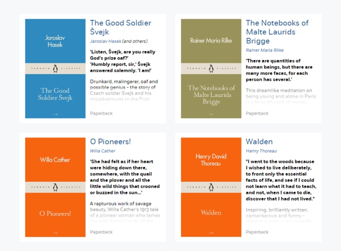
Not every Penguin book is associated with a ‘series’, a great number are not and of these, the cover designs vary extensively and can feature photographs, illustrations or simply just text. It would be difficult to pick out one of these more general Penguin books and be able to clearly identify it as having a Penguin ‘style’. However, for books that do belong to series, there is typically a very clear design to the covers of all the books in the series. I would describe these designs as typically quite illustrative and graphical in nature. They are contemporary, stylish and clean and simple. The covers often look quite ‘designed’. They will often feature just two or three colours with different books in the series featuring different colours. The designs are also quite ‘intelligent’ and witty.
Target Audience
Who are the design books aimed at? What is the age range of the young people the books are aimed at? Are the books gender neutral? How should the book be pitched, i.e. serious, arty, fun etc.
I spent an afternoon in the children’s section of my local library, looking at children’s information books.
Examples of General Children’s Information Book Designs
The Usborne Art Book About Colour – Rosie Dickins
Aimed at ages 7+


This book uses a large font. One topic is covered per double-page spread usually with an introductory paragraph at the beginning and then smaller blocks of information arrange around the pages. Small blocks of information are typically accompanied by an image to illustrate the point. Occasional illustrations and hand drawn curly arrows give a sense of fun.
Snapshots – Graphic Novels – Andy Seed
Aimed at ages 12 – 17
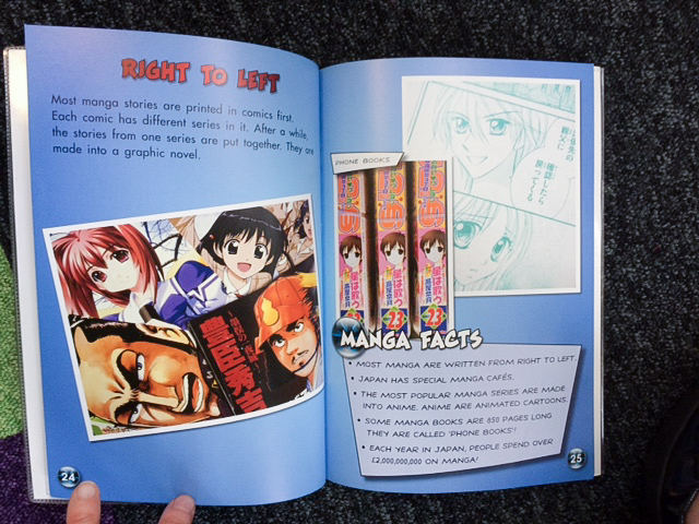

I didn’t like this book at all, mainly because there is very little information in it and I found it poorly structured and quite incoherent. The content of the book is presented in a very typical manga style.
Infographic Top 10 – Record breaking Buildings by Jon Richards and Ed Simkins
Aimed at ages 8 – 12


This was one of my favourite books that I reviewed. The book has a very clear objective and purpose. Each double page spread addresses a different ‘record breaking building’ topic. The layout and design is consistent across each spread giving the book design a very clear identity. Information on a spread is presented in a clear hierarchy with a title, introductory paragraph, small blocks of information with graphic illustrations and a ‘top 10’ chart. The illustrator – Ed Simkins is described on Amazon as “an award-winning graphic designer and illustrator whose work focuses on data visualization such as graphic organizers and innovative data maps.” ..it definitely shows. I thought this was a fun, visually very interesting and well structured book.
Tell Me a Picture – Adventures in Looking at Art by Quentin Blake
Aimed at ages 5 – 8 years


This book encourages children to look at artworks by hinting at the ‘stories’ contained within them. There is not much instruction in the book about the artwork, instead illustrated characters suggest things to look at. There are further notes on the painting at the back of the book.
The Usborne Book of Famous Paintings – Rosie Dickins
Aimed at ages 7+

There is more text in this book than in the previous Usborne book above but the style is similar. One spread is dedicated to a painting. Information is broken up into short paragraphs with a number of small points written in a ‘hand-written’ style font. Occasional hand-drawn illustrations and curly arrows add a sense of playfulness and fun.
Hands-On History: Ancient Rome by Philip Steele
Aimed at ages 8 – 12
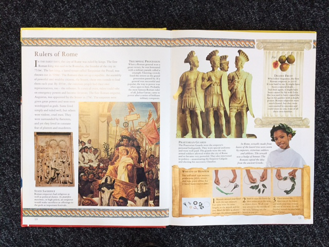
This book has a very typical ‘encyclopedia’ style layout. An introductory paragraph is followed by a series of smaller blocks of information accompanied by photographs or illustrations. A roman mosiac style border is included in the header and footer of each page and a number of spreads include a ‘things to make’ project presented on a scroll graphic. In this sense the layout design is consistent and does have a ‘Roman’ feel but I felt the layout was a bit too cluttered and rather obvious and therefore a bit dull. To me it looked like a travel guide and I wasn’t very inspired by it.
Shackleton’s Journey – William Grill (Flying Eye Books)
No official age group identified but reviews on Amazon suggest ~7 – 12 yrs.


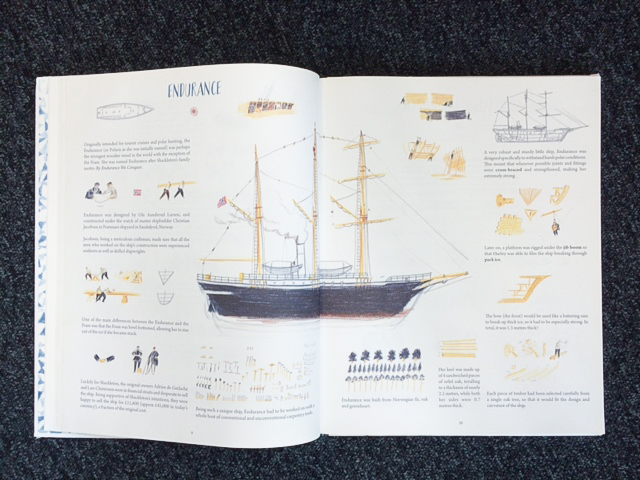
This was intriguing book. It tells the history of Shackleton’s antartic expedition but it is illustrated like a story book. The author of the book is a freelance illustrator. The book is a mix of quite long pieces of text, broken up into short paragraphs, and short blocks of information. The illustrations serve more to add visual interest to the book rather than specifically illustrate points made by the text.
Her Story – 50 Women and Girls Who Shook The World written by Katherine Halligan and illustrated by Sarah Walsh
Aimed at ages 8 – 12 yrs

There was much more text in this book than in others I had reviewed, so a longer read. Each spread featured one person. Each spread had an illustration of the featured person with a small number of additional illustrations or photographs. The illustrations are a consistent style and flowers and pastel colours feature a lot giving the book a feminine feel. The fonts used have a hand-written feel.
Get Into Photography – Take Brilliant Pictures in a Flash! by Suzie Hubbard
Aimed at ages 6 – 11 yrs

This book dedicates one spread per topic. Each spread has a title and introduction in a series of short paragraphs, and then a number of small blocks of text with headings and typically an associated image to illustrate the point. There are also ‘highlighted’ points in coloured circles. The typeface is quite large. The styling of the book is quite consistent throughout.
Examples of Design Book Covers
The book covers below re predominantly for adults but some children’s book covers are also included.
Typography
Colour
Photography
Examples of Graphic Design Books for Children
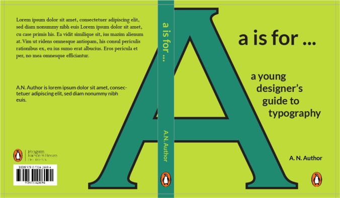
There are plenty of children’s books about colour and photography but I struggled to find any books specifically on graphic design or typography. I did manage to purchase a copy of ‘A Kidd’s Guide to Graphic Design’ by Chip Kidd whic I thought was a good, comprehensive and simple summary of graphic design concepts but it didn’t have any exercises for the reader to try things out for themselves, which I think would have been a nice addition for a children’s book.
Structure of a Children’s Information Book
How should the content of an ‘information-based’ book be structured for young people?
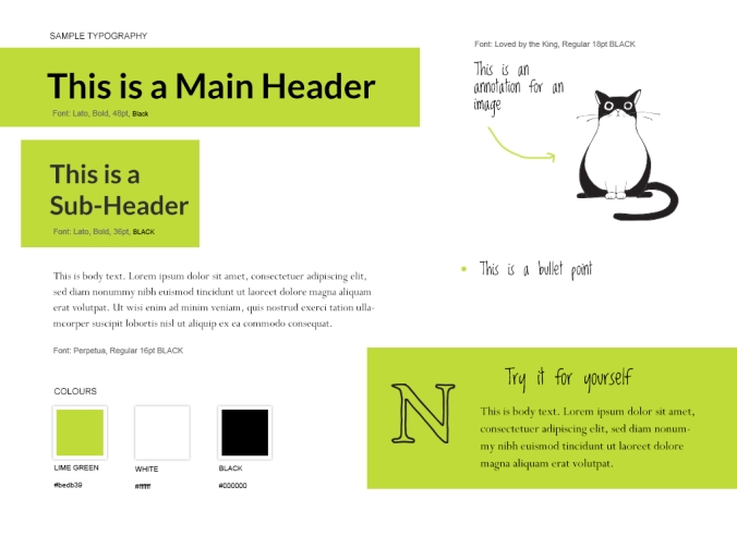
From my research looking at both the children’s informational books and adult graphic design books , I decided that each chapter of the books should have the following components:
- Main Heading
- Introductory Paragraph
- Section Heading
- Section Text
- Illustrations / Images with short text annotations
- ‘Fun Facts’ or ‘Did you know’ bullet points
- Try it Yourself – exercises for people to try
Typically, the younger the age group the book was aimed at, the less text there was. Within the 8 – 12 age range, the amount of text varied a lot with some books, such as ‘Her Story – 50 Women and Girls Who Shook The World’ having a lot of text. I felt that I wanted my book not to be too light on text and content (as it was with ‘Snapshots – Graphic Novels’ by Andy Seed) but also not too wordy so that young people would get bored reading it.